GRAPHIC DESIGN
"Trash Iconography"
Role
Graphic Designer
Team
Solo Project
Timeline
Fall 2025: 3 weeks
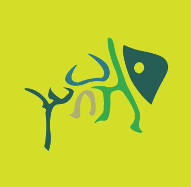
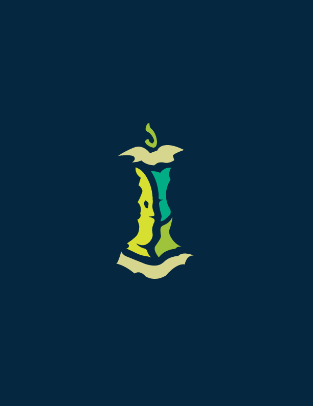
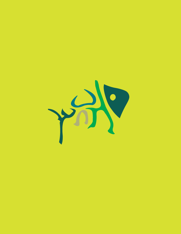
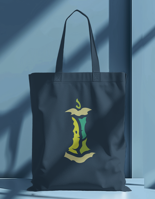
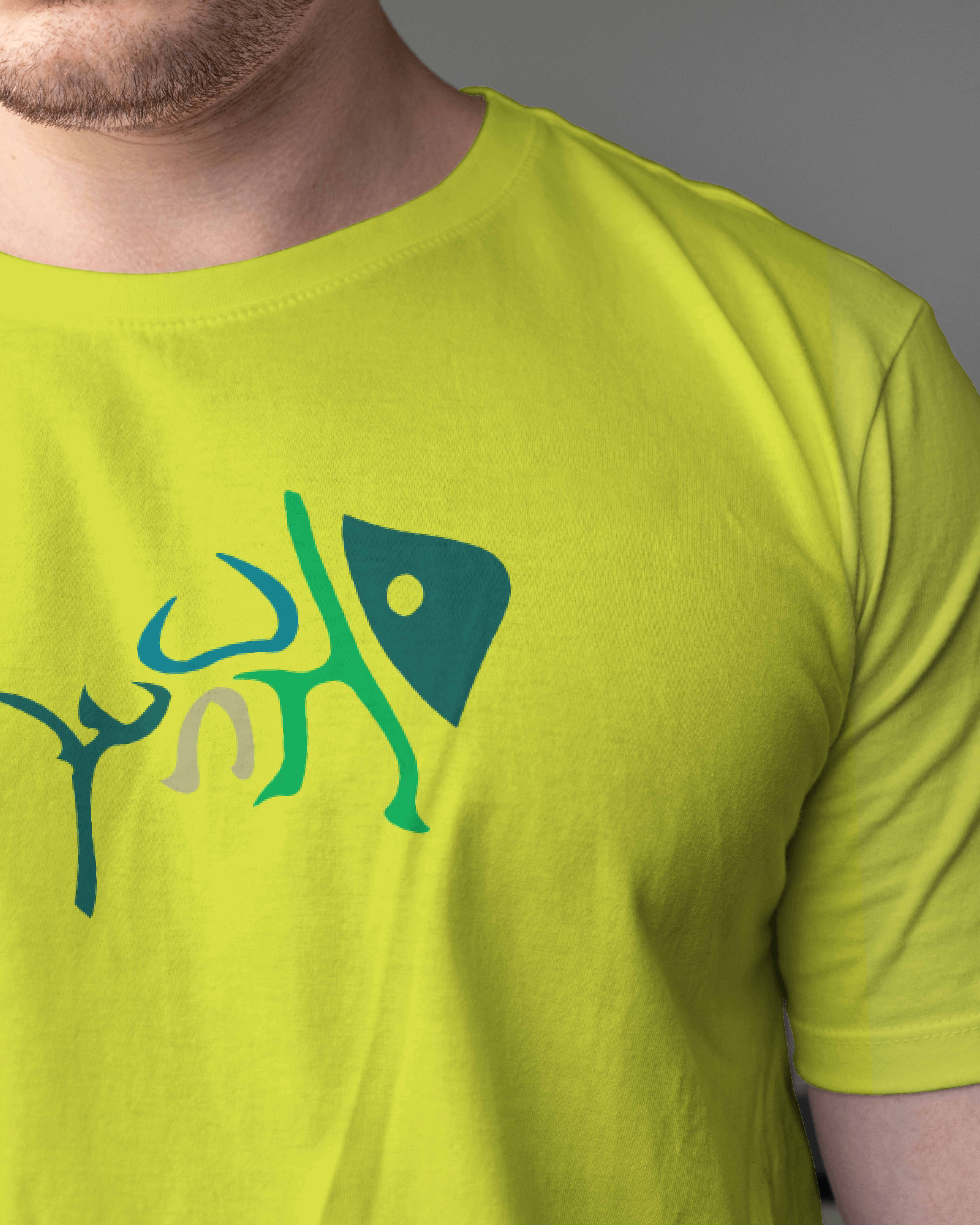
A set of experimental icons that elevate discarded items like food remnants, using negative space, calligraphy-like strokes, and a decomposition-inspired color palette to give visual identity to often overlooked waste.
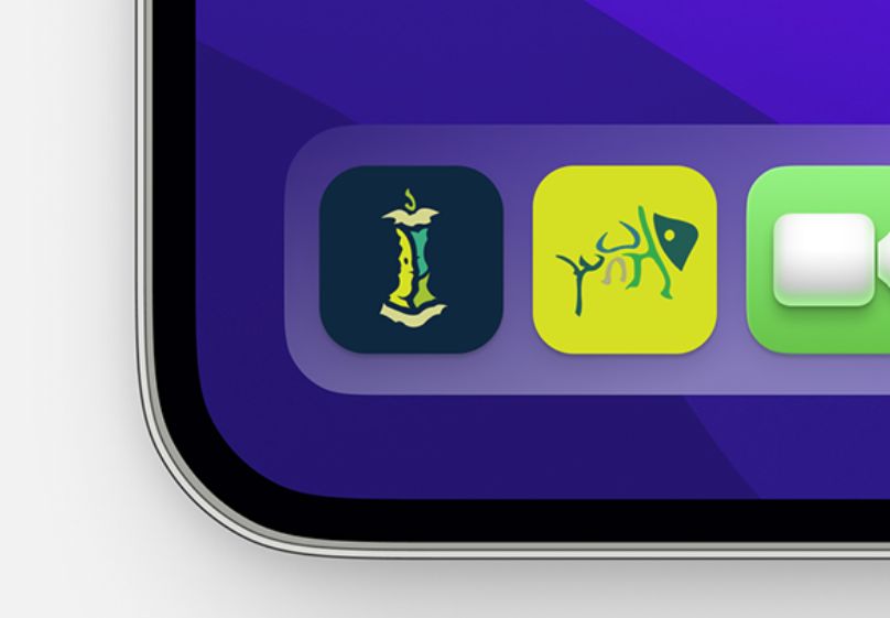
App Mockup
Overview
This project explored the aesthetic potential of trash, food remnants, and items typically ignored in visual design. By creating bespoke icons for discarded objects, I sought to transform mundane waste into a cohesive, design-forward, and color-striking visual system.
Problem
Standard icon sets often overlook "forgotten" items like food waste, leaving these remnants without a clear visual representation. There was a need to create a design language that could represent the scattered, imperfect, and decaying nature of these objects while maintaining a balanced, professional aesthetic.
Process
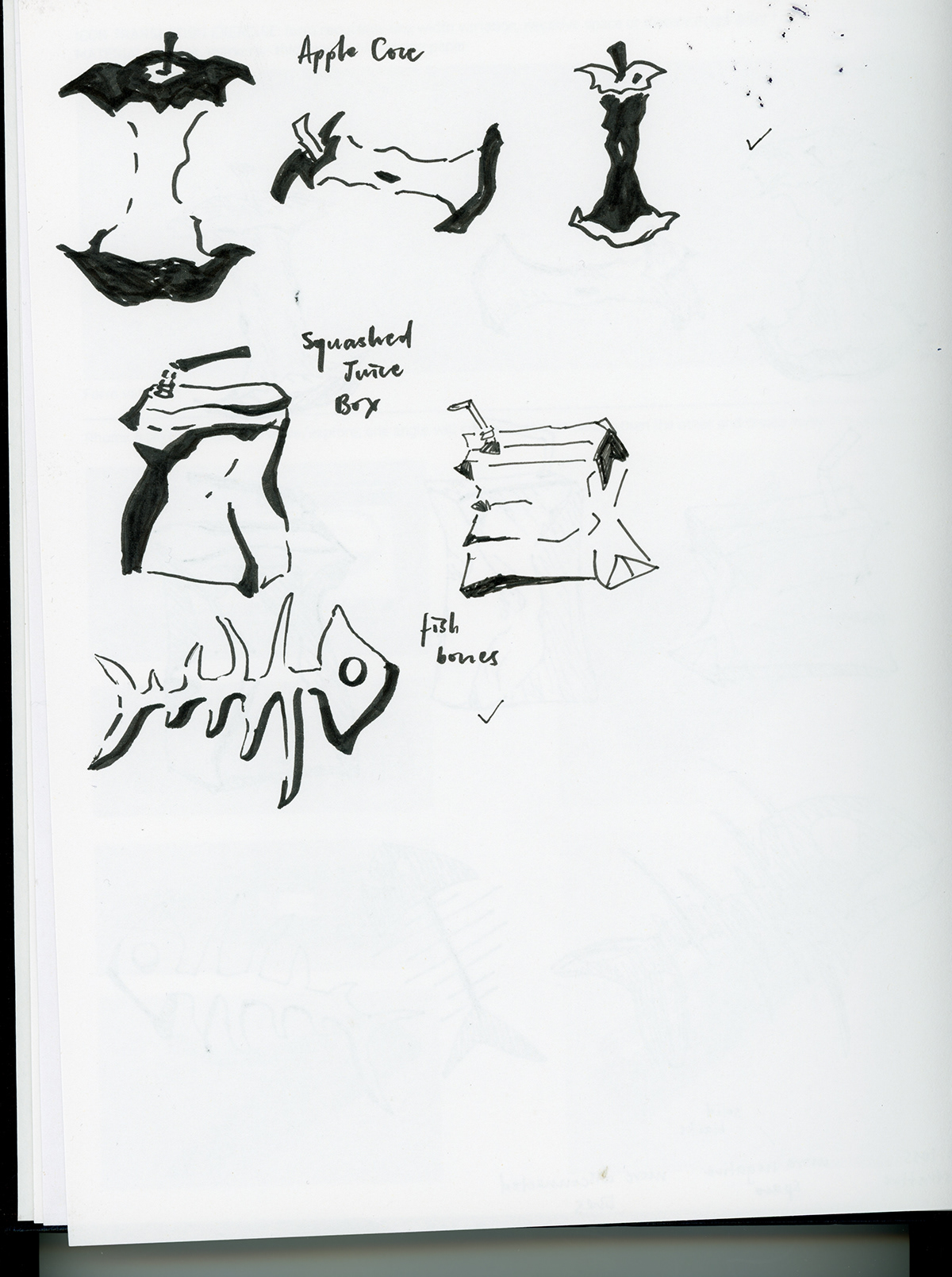
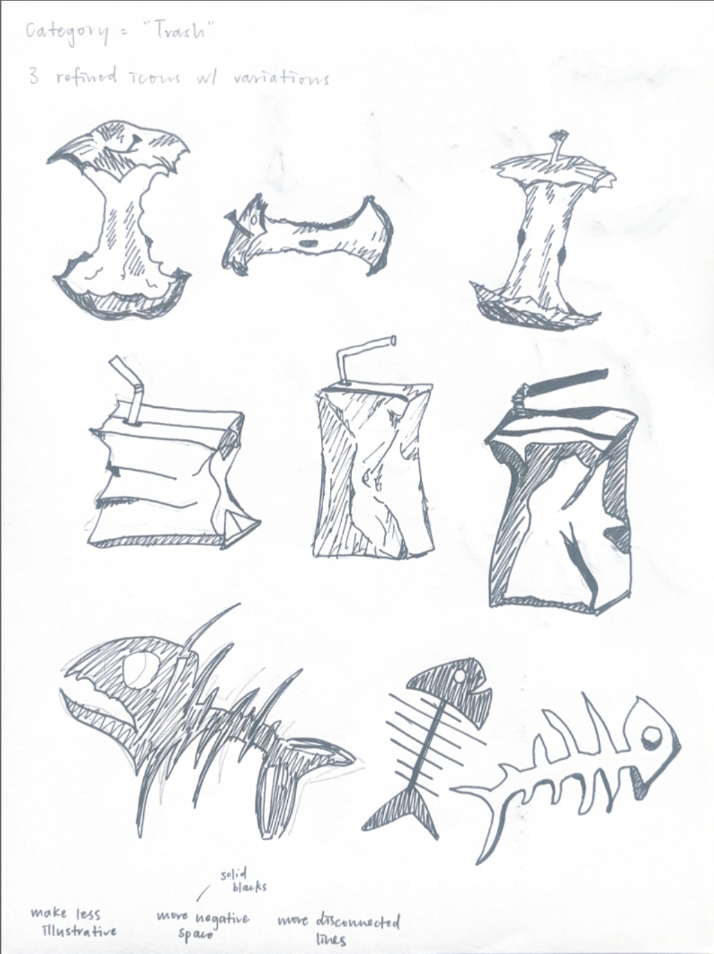
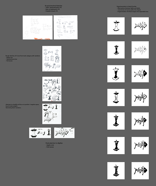
- Ideation & Reduction: I started with ten concepts, ranging from ripped paper to bones, before narrowing the selection to an apple core and a fish skeleton to focus on simplification.
- Negative Space Experimentation: Through black-and-white drafting, I explored fragmented lines and weight distribution, testing how much detail could be removed while still maintaining recognizable compositions.
- Vector Technicality: I translated these hand-drawn drafts into Adobe Illustrator, which required rigorous attention to anchor points, stroke weights, and the conversion into a scalable, color-integrated format.
Product
The final icon set utilizes thematic design tactics to communicate decay and informality:
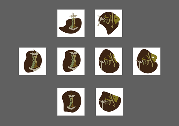
- Fragmented Composition: The icons are built from various vector shapes to visually communicate the scattered, incomplete nature of food remnants.
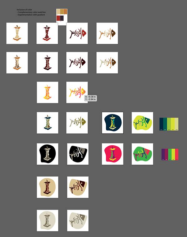
- Atmospheric Palette: A complementary color scheme of greens and browns was chosen to evoke the visual language of organic waste, mold, and decomposition.
- Asymmetrical Framing: An irregular background outline mirrors the organic, unpredictable shape of a food scrap or a spilled drink.
Reflection
This project deepened my understanding of how technical constraints, such as ensuring icon clarity at small scales, interact with abstract thematic goals. I learned that designing for "imperfection," like the chaotic nature of decay, actually requires a highly disciplined, precise approach to vector work and balance. I pushed myself to find beauty in the discarded and am reminded that strong product sense involves applying intentional design to even the most overlooked aspects of our everyday lives.
The People Party
Role
Graphic Designer
Team
Solo Project
Timeline
Fall 2025: 3 weeks
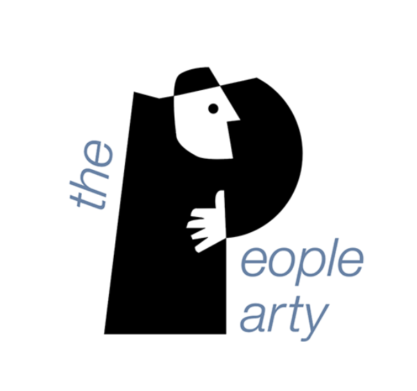
I designed "The People Party," a networking platform brand identity that merges human silhouettes with typography to foster a welcoming, humorous, and inclusive community atmosphere.
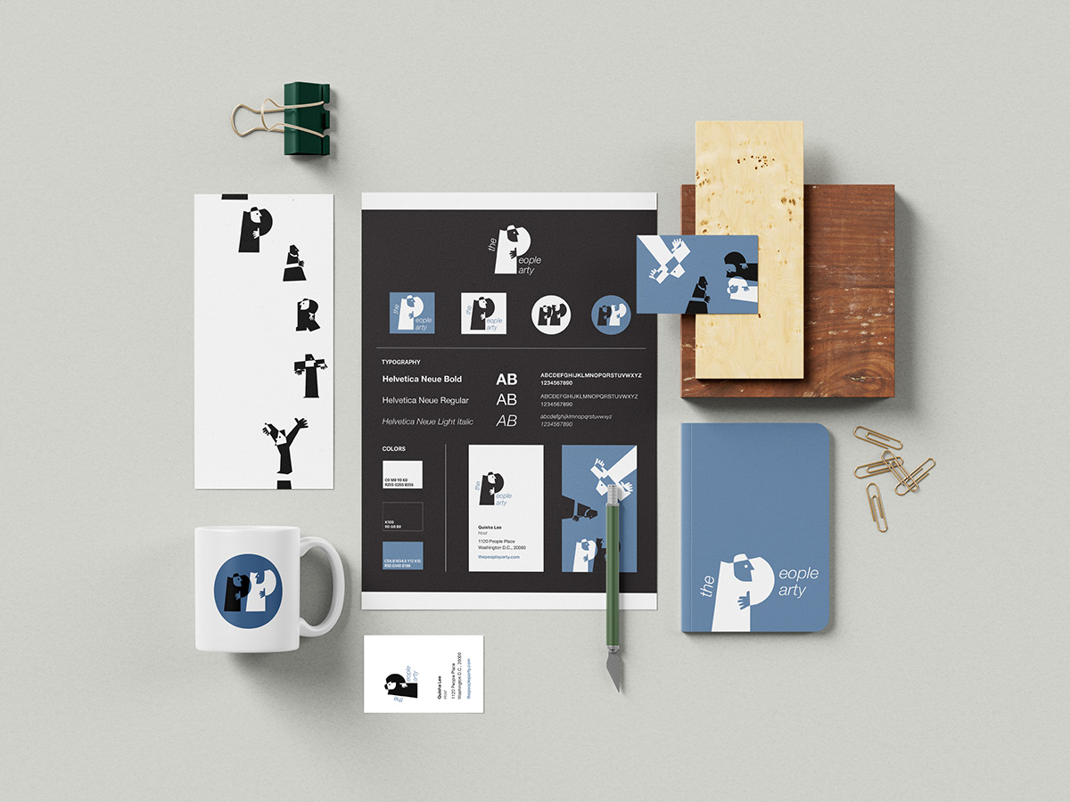
Brand System
Overview
"The People Party" is a social networking platform aimed at building community by highlighting the value of the small and casual human interactions. The visual identity uses playful, interconnected shapes to emphasize the warmth and entertainment of gathering people from diverse backgrounds together.
Problem
The primary challenge was overcoming the "anonymity gap" inherent in modern digital networking. Most platforms facilitate connections through sterile, text-heavy profiles that strip away the personality and physical presence of the users, making the initial stages of community building feel distant and impersonal.
Process
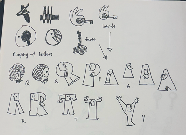
- Concept Evolution: My process moved from creating individual personal branding to designing a comprehensive service platform, ultimately settling on transforming human bodies and gestures into simplified, expressive shapes.
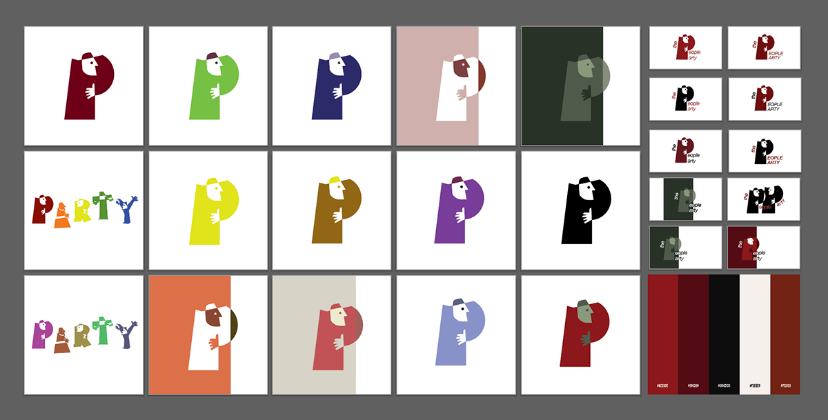
- Color Palette Pivot: I initially worked with a red and black color scheme, but pivoted to a blue palette to enhance visual clarity and ensure the human-centric shapes remained distinct and readable across digital and print applications.
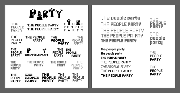
- Design Rigor: I focused on balancing thick, impactful icon stroke weights with specific typography tracking to ensure the design remained readable yet visually striking.
- Negative Space Exploration: Using the shape builder tool, I layered positive and negative spaces to create a cohesive set of logos that feel unified through a consistent color theme and thick-stroke aesthetic.
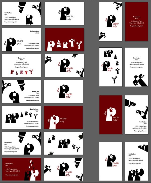
Product
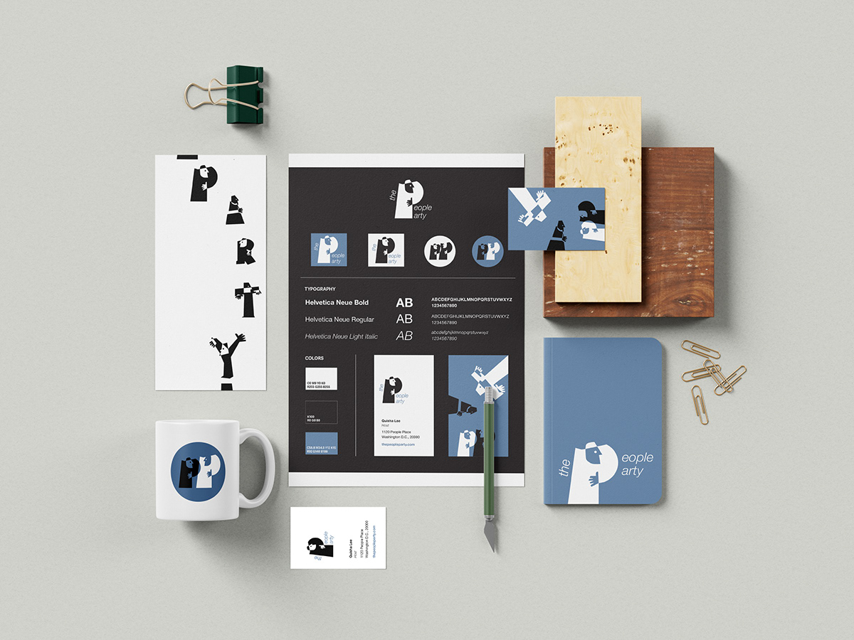
The branding suite utilizes a cohesive design system across all touchpoints:
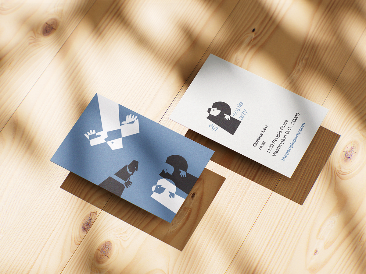
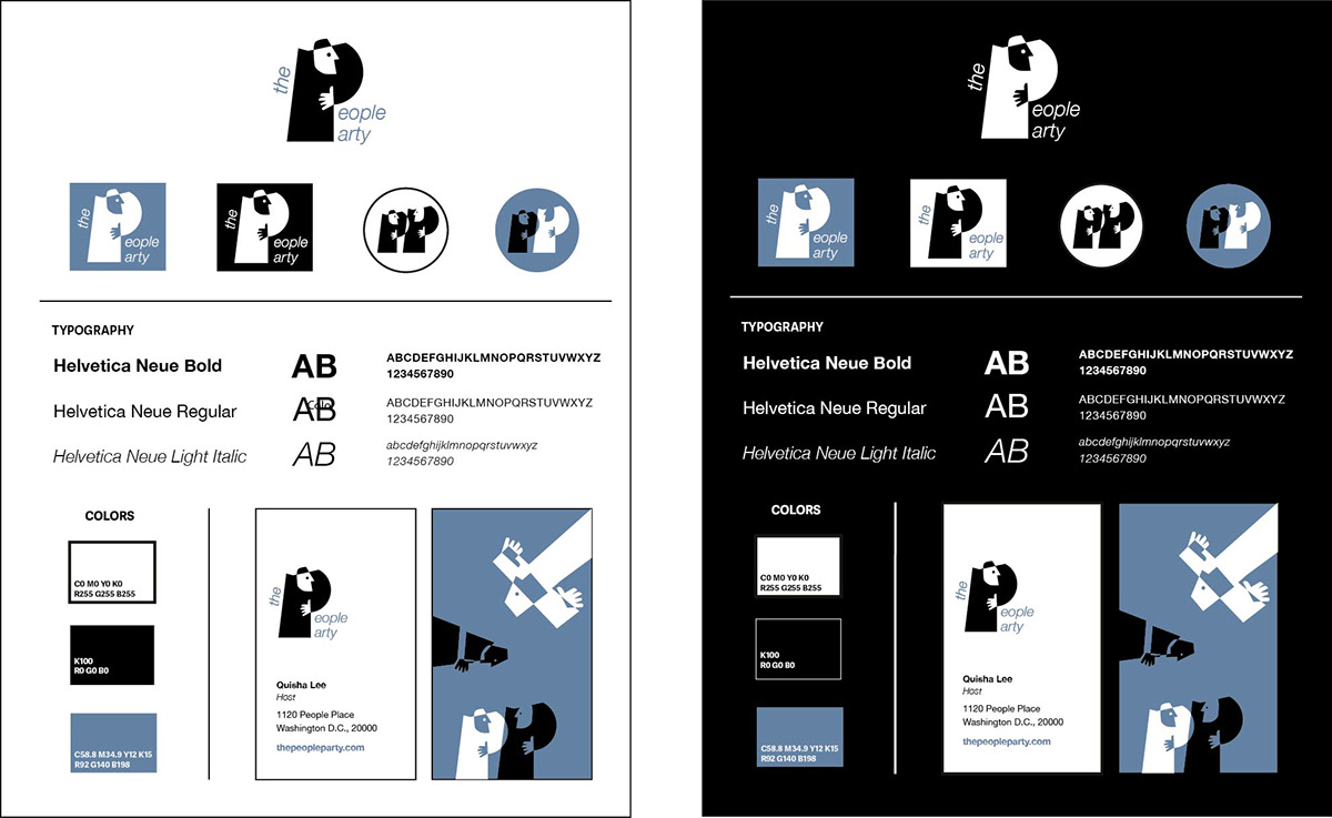
- Human-Centric Geometry: The logo integrates alphabetical letters with abstract human silhouettes, communicating a fun and interactive ambiance.
- Balanced Typography: I utilized Helvetica Neue in various weights to ensure a professional foundation that complements the whimsical nature of the icon set.
- Unified Collateral: The business cards feature witty, comical character positioning, bridging the gap between corporate professionalism and community-focused lightheartedness.
Reflection
This project deepened my understanding of how a brand's visual elements can act as a catalyst for community-building by setting a specific emotional tone. Achieving the right balance between corporate structure and playful expression is essential for making a service feel both legitimate and inviting.
Ultimately, this work reinforces my belief that effective product sense, even in graphic identity, relies on human-centric design to create memorable, everyday experiences that bring people together.
Wu Zhi Qiao Charitable Foundation
Role
Graphic Designer
Team
Student Volunteer Group
Timeline
July-August 2025
A comprehensive brand identity system for a charitable foundation focused on community impact and social good. The design system balances professional credibility with approachable warmth to reflect the organization's mission of creating meaningful change.